Users report
The Users tab of Dashboard → Reports shows who's running sessions.
The Users tab of Dashboard → Reports shows who's running sessions. What you see depends on your role.
What admins see
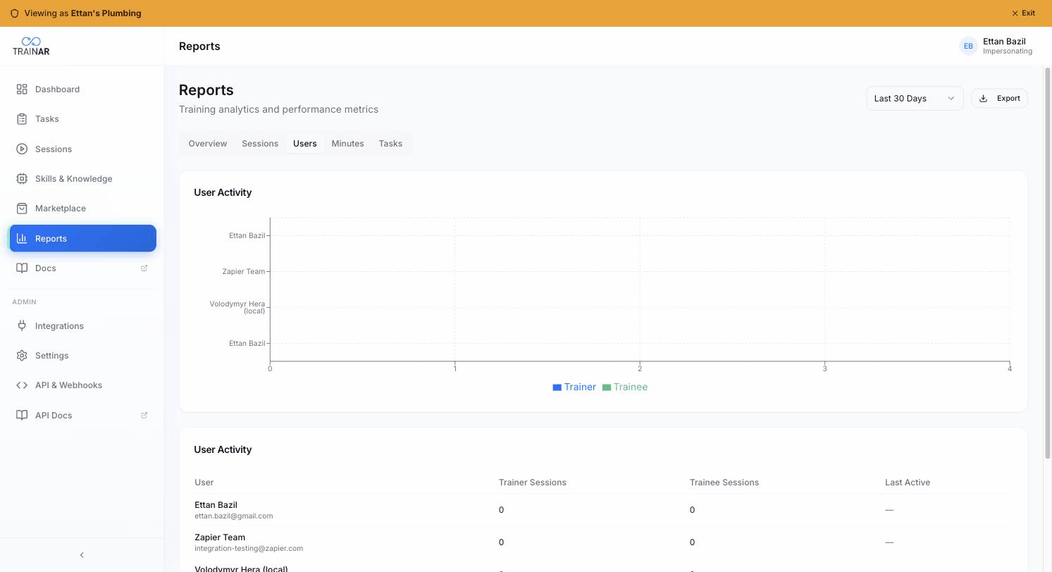
User Activity bar chart (top 10)
Horizontal bar chart of the top 10 users by session count across the selected period, stacked Trainer (blue) + Trainee (mint). Quickly shows your heaviest TrainAR users and their mode split.
User Activity table
Every user with their:
| Column | Notes |
|---|---|
| User | Name + email |
| Trainer Sessions | Count in selected period |
| Trainee Sessions | Count in selected period |
| Last Active | Date of last activity, or — |
Inactive Users alert (admin only)
If anyone on the team has zero trainer + zero trainee sessions in the selected period, an amber card appears listing them by name. Useful for spotting adoption blockers — engineers who aren't using the platform might need coaching, a device issue diagnosed, or a different procedure to start with.
What engineers see
Engineers (non-admin) see only their own row in the User Activity table, titled "My Activity". No org-wide chart. No inactive-users alert.
How to use it
Common questions this tab answers:
- Who's our power user? Top of the bar chart.
- Is anyone not using TrainAR at all? The inactive-users alert.
- What's the trainer/trainee mix per person? Stacked bars in the chart.
- Who hasn't been active recently? Sort the table by Last Active (or check the inactive alert for the binary case).
What's NOT here
- No per-user minute breakdown — minutes are pooled account-wide; per-user attribution isn't surfaced
- No filter inside this tab (the page-level period selector applies)
- No CSV export from this tab alone (use Export at the top of the page with Users selected)
Where to next
- Reports overview — Top Performers card lives there too
- Settings → Users — invite, deactivate, manage users
- Sessions report — what kind of sessions the team is running